THE PROBLEM WITH RADIO BUTTONS:
There are several problems with radio buttons that one has to face when adding them to a website code. The most common issue is that in certain browsers (i.e. Firefox), the stock radio buttons are not resizable. This can lead to the following appearance in various cases:

This makes using the stock radio buttons quite inconvenient. There is a common workaround, that is adding a ‘content’ property to the ‘input… checked + label:before’ selectors in the CSS, something like:
input[type="radio"] {
  display: none;
  }
input[type="radio"]:checked + label:before {
  content: "\2022";
  }
See the Pen Radio \2022 by Bence Varga (@bencuri) on CodePen.
In the example ‘display:none’ will deactivate the stock button, and instead, a dot will appear in the checked button due to adding ‘content:”\2022″ ‘.
But even this solution is not perfect, in case resizing of the buttons happens when the page is displayed on various devices. The dot in the middle of the button might appear off-centered, like this in this photo (or in the codepen example above as well, depending on your device):
So as you can see, you need to find a different approach to scale or resize radio buttons precisely. But what is the method that can work?
THE SOLUTION:
Probably you already know these imperfections well, and wondered how you can avoid them. Here is a solution, that will create radio buttons in your website that will always scale perfectly:
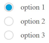
See the Pen Black button by Bence Varga (@bencuri) on CodePen.
The essence is, instead adding a dot with a ‘content ‘ declaration to the checked input, you just define that the background should switch to a specified color when the input is checked, and a box shadow should appear around it. Here are the essential parts of this code one by one. This way, you will know where to set the most important features:
.radio {
   ……
   cursor: pointer;
}
This will make the cursor appear as a small hand when you are hovering above the button or its corresponding text.
input[type="radio"] {
  display: none;
}
This will disable the stock radio button that can have some display problems in certain browsers.
.radio:before {
  background: #fff;
  ...
  border-radius: 100%;
  ...
}
‘background’ will define the color of the button when unchecked.
‘border-radius: 100%’ is needed to make the button a circle. If you omit this, you will create rectangular buttons.
input[type="radio"]:checked + label:before {
   background-color: #00a0db;
   box-shadow: 0px 0px 0px 3px #fdfbfb inset;
}
‘background-color’ will define the color of the dot.
‘box-shadow’ will create the border around the dot. You can set the thickness of the border at the 4th size property (3px in the example). Adding inset is essential to have the border inside the circle.
You can customize the code above in the example, to make the button match your needs. You can modify the shape of the button to a rectangle, adding shadow, etc. A useful example might be one for white background:
See the Pen White button by Bence Varga (@bencuri) on CodePen.
Everything is very open with a precise clarification of the challenges. It was really informative. Your website is useful. Thanks for sharing!